An Introduction to Color Theory
Whether it’s a pink-streaked sky during a sunset or a bright red cardinal on a wintertime branch, the right colors in the right places have the power to make us stop and stare. Your brand assets are no different: colors fuel the thoughts and associations, both conscious and unconscious, that your customers and clients form about your product or service. Simply put, colors are key in establishing—and maintaining—your brand identity.

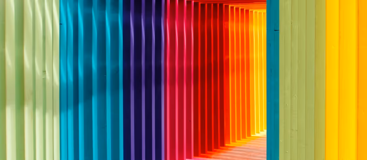
ROY-G-BIV—Ever Heard of It?
What’s the first thought that comes to mind when you think of blue? Maybe it’s the ocean. Maybe it’s a social media logo. Maybe it’s the fact that it’s the favorite color of pretty much everyone you know. No matter what pops into your head, it’s clear that the significance of different colors is far from one-dimensional. Here’s a quick overview of color connotations, along with examples of companies that use them in their branding:
Red evokes passion, love, a sense of alarm, danger, anger, blood, fire, romance, lust, appetite, energy, dynamism, boldness, power, and motivation.
Brands that use it: Netflix, CVS, Yelp, Target
Orange evokes energy, stimulation, rejuvenation, enthusiasm, vitality, flamboyance, risk-taking, sociability, positivity, boldness, and communication. It’s an offbeat color that generates associations with creativity and quirkiness.
Brands that use it: Penguin Random House, Whiting-Turner, Home Depot, Reuters
Yellow evokes happiness, positivity, confidence, energy, fun, pleasure, and accessibility. It’s an attention-grabber that’s also associated with appetite. Beware of its negative associations, though, which include anxiety and illness.
Brands that use it: McDonald’s, EY, UPS, Snapchat
Green evokes nature, gentleness, novelty, freshness, purity, health, connection, tranquility, harmony, safety, prosperity, wealth fertility, growth, productivity, and focus.
Brands that use it: Deloitte, Robinhood, Duolingo, Beyond Meat
Blue evokes tranquility, peace, order, relaxation, comfort, stability, assurance, mental stimulation, authority, confidence, trust, responsibility, safety, and intelligence. One of its strengths is that it is universally likable, but it also risks being ordinary as a result, especially since so many big tech companies (read: social media platforms) use it.
Brands that use it: AT&T, Intel, Twitter, LinkedIn
Purple evokes regalness, magic, mysticism, power, luxury, wisdom, nobility, status, and ambition.
Brands that use it: Accenture, Wayfair, Aetna
Pink evokes tenderness, love, innocence, optimism, hope, peace, and warmth. It’s a traditionally gendered color with links to femininity and all of the gendered associations that come with it.
Brands that use it: T-Mobile, Lyft, Dunkin’ Donuts
While these are the psychological associations most people have, the significance of these colors varies from culture to culture. Red in China signifies luck and happiness; green in Mexico signifies independence; and orange in India signifies sacredness. As with all messaging, the context of your color scheme matters.
Website Strategy: Grounding Your Hues in Neutrals
Look at any of the aforementioned brands and you’ll realize that the color in the logo is often nothing more than an accent color in the context of the website itself. Unless the brand has a whimsical element that makes a palette of bright colors fitting, neutrals ground a brand’s visual presentation in professionalism.
Black takes on a different significance depending on context, but some of the more useful associations, business-wise, are those of sophistication, power, mystery, tranquility, containment, formality, and seduction. Black can be severe, though; softer blacks often create more balance within a color scheme.
White has a number of traditional connotations, including purity, innocence, integrity, lightness, cleanliness, sophistication, and simplicity. On the other hand, though, it can have an isolating quality, giving rise to feelings of austerity and sterility. Although the phrase “too much white space” only really describes space that’s empty, the association with white makes a blank space seem even more austere when it is white.
Gray, as a color, contains subtleties, variance, and neutrality. Warm grays are cozy, and cold grays are just that: cold. Gray is the color of settlement, in-betweenness, foundation, and maturity. Like a bowl of pasta, gray takes on the flavor of the colors surrounding it.
Brown is associated with resilience, earthiness, softness, growth, safety and security, humility, warmth, loyalty, trust, maturity, and strength. It’s the opposite of luxury and decadence, and, unsurprisingly, it’s the most dominant color on the planet. It’s not an attention-grabbing color, which makes it the perfect addition for balancing out your website’s visuals.
Add any of these to a hue and you get tints, shades, and tones—hues with the addition of white, black, and gray. Tints, shades, and tones help either sharpen or soften the message you’re trying to get across, as well as create the right amount of contrast necessary to make your content readable and, quite literally, easy on the eyes.
Color Organization
There are lots of different ways to organize and describe the relationships that colors have to one another. The most basic are these:
- Primary colors: blue, yellow, and red. These colors can’t be made by combining any others.
Secondary colors: purple, green, and orange. These colors are made by combining others—in this case, any of the primary colors. - Tertiary colors: magenta (red-purple), vermillion (red-orange), violet (blue-purple), teal (blue-green), amber (yellow-orange), chartreuse (yellow-green). Combine a primary color with a tertiary color and these are what you end up with.
The relationship these colors have to each other can easily be seen on a color wheel, which is an essential tool for design. You can see opposing colors and how they work together in harmony.

More categories of colors become apparent on the color wheel, the most obvious being warm colors and cool colors. Warm colors—the reds, oranges, and yellows of the world—have energetic associations. Cool colors, on the other hand—your purples, blues, and greens—have a more restful feel to them.
Complementary colors sit directly across from each other on the wheel. They’re often used to create contrast and emphasis, but within the sphere of a design palette, they’re rarely both used to the same degree. There are also split-complementary colors, in which one of the complementary colors splits into adjacent territory on the color wheel. (Blue and amber, for example).
Other color relationships move horizontally, vertically, and even geometrically across the wheel. Analogous colors sit on the wheel adjacent to one another, all in a row. A monochromatic color scheme uses all of the same hue but in different tints, shades, and tones. Or, draw a perfect triangle or square on the color wheel—the colors you hit will form a triadic or tetradic color scheme.
In the digital sphere, colors are organized with RGB color theory, which describes colors based off of the percentage of red, green, and blue it contains. This is reflected in HTML hex codes: #FF0000 is red, #00FF00 is green, and #0000FF is blue. RGB is based on light and is considered an “additive color model”: the more light you add, the closer you get to white. There are other color models, of course, but RGB, which can represent a greater variety of colors, is the one primarily used by graphic designers.
How to Choose a Color Scheme
By now, you probably have an idea of what you want your brand identity to be. So, think of three adjectives to describe your brand. Is it boundary-pushing, high-tech, and solutions-oriented? Approachable, fun, and centered on self-care and improvement? Or is it relationship-focused, nourishing, and highly communicative?
There are color schemes to express each of these. Let’s take a look at some of the leading companies in each of their industries:
Apple
Colors: originally rainbow; now gray
Does Apple even need an introduction? Look at the phones and laptops of the people next to you—especially if you’re in the States—and it’s likely an Apple product.
The Apple logo from back in the day used to be rainbow, demonstrating their innovative, out-of-the-box creativity. But now that they’ve proven themselves to be boundary-pushers, the company has pivoted to gray as their representative color. As mentioned previously, gray evokes technology, foundations, industry, and the literal hardware of Apple products. Figuratively, though, Apple products become the hardware of our lives. The subtlety of gray points to how Apple products are absolutely everywhere and are always there in the background—even if we’re not consciously aware of it all the time.
On the website, gray is at the forefront, allowing Apple to highlight its bevy of colorful products, putting more of an onus on the uniqueness of each innovation.
Starface
Colors: bright yellow, black, white
Starface is one of the leading skincare brands for Millennials and Gen Z-ers in particular. Their signature product is a star-shaped pimple patch.
Here, the bright yellow does a lot of the heavy lifting: it invites the consumer to reassociate something negative—acne—with the joy of self-care and self-celebration. The contrast the yellow has with the accenting black and white gives a pop art feel to the brand, signaling that while the idea of covering your spots in stars is a little over-the-top and childlike, it’s still kitschy in an appealing way.
On the site, the bright yellow is everywhere, and it’s accompanied by a rainbow of brightly colored accents. Again: the message that’s being sent here is that the product is fun to use.
Vitakraft
Colors: blue, red, bright pink
Vitakraft is one of the leading pet treat brands in Europe, and it’s just starting to make inroads in the US market.
Your pet’s health is in Vitakraft’s hands, and the dominant blue color communicates that their product is safe and responsibly crafted. It also evokes confidence and trust from the consumer, giving them the comfort and assurance to know that their pet is in good hands. The red accent color evokes health and vitality, but the real star of the show here is that bright pink. Not only is it a unique choice for branding, but it communicates peace, warmth, tenderness, and love—all of which you’ll share with your pet if you give them Vitakraft products.
On the site, blue is still the dominant color, but all of the call to actions are in red and pink, enforcing that cause and effect relationship between purchasing Vitakraft products and having a better relationship with your pet.
When considering your own color schemes, ask yourself these questions:
Think of your audience. What’s their…
- Age/generation?
- Region?
- Gender?
- Cultural background?
- Biggest needs?
Think of the product or service you’re actually marketing:
- How you want your audience to feel when using your product or engaging with your service?
- What color schemes have resonated with you in the past, and why?
- What colors do your competitors use, and how can you differentiate from them?
Other questions to ask:
- Are all parts of my website legible?
- Is my color scheme unique in some way?
- Is there an effective balance of colors and neutrals?
- Do I have an effective balance of color usage, as in dominant colors and accents? Is my hue distribution around 60% dominant color, 30% accent color, and 10% accentuating color?
- Am I using certain colors for certain parts of my website, so the color demarcates a certain thing and gives a sense of order?
- Am I leveraging tints, shades, and tones?
- Does my use of color get across the message I’m intending to get across
If you’re lost, asking yourself these questions will bring you closer to the design elements that work best for your brand. And if you’re still lost after that, folks who specialize in web design can light the way.
